UX Case Study
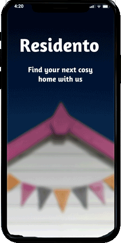
RESIDENTO
Search for real estates via web app
This project dealt with the UI elements needed to develop a web app—a project as part of my 2021 UX training at Career Foundry.
BRIEFING
Residento was a project for my UX training with Career Foundry in 2021. It's a responsive web app (mobile-first approach). The app is designed for users who search for a new place to live. The project goal was to get different UI design ideas and show how my layouts work on various devices.
Who
People with good incomes are looking for real estate. Preferably families, as the app includes some features for families.
What
A web application with a liquid layout for different screen sizes but focused on mobile devices.
When
Anytime, but likely in the evening, on weekends, and outside office hours.
Where
For the use anywhere, but preferably at home or in the office when users are focused on the search. Less so when they travel and on the road.
Why
Users need a quick overview of what's offered in a foreign city. The key is to quickly provide them with what they need in their everyday lives and neighborhoods.
Understanding the User
I didn't have to do user research like the previous one in this project The target group I needed to create my app for:
- has only limited time to find a new place to live.
- is used to achieve good results quickly
- makes decisions based on reliable information
My Objectives in UI
Designing a responsive web app
My design goal was to make the app as straightforward and intuitive as possible on all devices available today, so I could not consider some intuitive features like Face- and TouchID.
MY ROLE
UX and UI Designer with a focus on:
- Customer Journey and User Tasks
- Prototyping Wireframes (mid-and high fidelity)
- Design Documentation
- Handover to Development teams

PERSONA

Christina
Mother of 2 children • Bachelor's in Computer Science and Master's in Advanced Computer Systems
Age: 42 years
Gender: Female
Education: Bachelor's in Computer Science and Master's in Advanced Computer Systems
Martial Status: Married with 2 children
Her Goals
- Rashida makes a good living and wants to invest in the property beyond the city to increase her family's financial security.
- She wants to find the correct information for fast decision-making.
- She wants a tool to help her find suitable properties, not waste her time.
Her tasks
As she is new to real estate, she wants an easy tool to use to help her find the property she's looking for.
- Search for properties, inputting criteria relevant to what she's looking for.
- Quickly view and return to her favorite properties.
- Receive relevant and comprehensive information about properties.
Her Environmental
- Physical: Rashida lives with her family in a city on the east coast and spends most weekends in the countryside.--> Adopted to the German market to a person living in a big city like Frankfurt/Main.
- Social: She likes hiking with her family and playing basketball with old colleagues and friends from college. A colleague recently invested in property and suggested Rashida look into it, too.
- Technological: As a computer science graduate, she describes herself as highly competent with technology. She is always on top of the latest trends in tech and always has the newest model of smartphone. She regularly uses online tools to help schedule her work and social life and communicate with friends, family, clients, and colleagues. The tools she uses are functional, easy to use, and intuitive.
USER FLOW

Searching for new properties can be very sophisticated when users look for an ideal new place to live.
On the other hand, no one wants to spend too much time on a mobile device while browsing hundreds of options. I, therefore, had to find a good balance between the fastest track through the customer journey and a meaningful search function with relevant filter criteria.
As the time for this project was limited to roundabout six weeks, I decided to start with a minimal viable product (MVP) consisting of a simple route without significant branches.
My persona Christina is a busy woman with two children and no time for complexity. She wants quick results and maximum customization for her needs.
IDEATION & PROTOTYPING
WIREFRAMING
The advantage of wireframing is to play with your ideas without asking developers or spending time for working in CMS. Modern CMS tools actually have pre-designed components that you only need to drag and drop into your design. But wireframing helps you to iterate your design and get an overview of your customer journeys and click-routes.
The brief was to create a native app. Native apps can be used on different browsers (e.g., Chrome, Safari) and are not embedded in App–Stores. The design adapts to various screen sizes, so native apps often use fluid design or breakpoints. For this project, it was crucial to find a good layout for filtering criteria you need to find your property. I used toggles, sliders, and chips to assist users in searching for their new homes. The four different wireframes show examples from my mid-fidelity design.


Mid-Fidelity Wireframes. Created with FIGMA Design-Tool.
MOOD-BOARDS
I created two various mood boards to show different design ideas for my app.
Mood Board 1

I chose muted colors and playful fonts for my first mood board. Because this style is used very often,
I decided against this one for my app. However, I continued to use the fonts family Amaranth for my headlines because it fits well with the claim to reach families with this app.
Here are some reasons why I ultimately decided against this mood board.
- Too many other competitors with muted colors.
- Colors do not appeal to users and seem rather dull
Mood Board II

I chose a new color code with a dominant blue and magenta color gradient. I decided against Ruda as a fonts family as I felt it wasn't playful enough for my understanding to appeal to families with my app.
Here are some reasons why I ultimately decided on this mood board.
- Fresh look and modern colors
- Playful fonts families are appealing to families.
- There is a blue ocean (no big competition) with this design combination for now.
User Centric Design
Mid Fidelity & High Fidelity
Families usually are well organized. However, they need an excellent infrastructure to manage their daily lives.
Families looking for a new house are also looking for a good location and infrastructure. That’s where my app comes in. In my wireframes, I considered the unique needs of families by adding particular questions for them and a rating to show them how well the properties correspond to their needs.


Mid-Fidelity Wireframes. Created with FIGMA Design-Tool.
DESIGN DOCUMENTATION & DESIGN ELEMENTS
The design documentation was much fun. This project allowed me to design with my unique colors, fonts, and graphic elements from scratch. As I usually have to consider the company’s brand guidelines for my work, I had much freedom to express myself and my design skills here.
Primary Colors
Yale Blue
HEX: 06468F
RGB: 6,70,143
Magenta Dye
HEX: bf2a70
RGB: 191,42,112
Secondary Colors
Lapislazuli Blue
HEX: 2760A1
RGB: 39,96,100
Tyrian Purple
HEX: 520227
RGB: 82,2,39
Black Blue
HEX: 162544
RGB: 22,37,68
Lawn Green
HEX: 7bfc0A
RGB: 123,252,10
Black & Grey
Eerie Black
HEX: 222222
RGB: 34,34,34
GrayCopy
HEX: 61605F
RGB: 97,96,95
Inactive Gray
HEX: C4C4C4
RGB: 196,196,196
Light Gray
HEX: EBE9E9
RGB: 234,232,232
FONTS
I chose two font families for my app to keep the design clear but flexible enough to structure elements better among themselves. Amaranth is used for Headlines and Open-Sans for text blocks. Amaranth is a playful, modern font family available on Google Fonts. Roboto is a popular font, available on all devices, and an excellent counterpart to Amaranth.
Headlines
H1-H4
Amaranth Bold
H1 = 34 px, Line Spacing = 40 px
H2 = 26 px, Line Spacing = 32 px
H3 = 20 px, Line Spacing = 32 px
H4 = 16 px, Line Spacing = 24 px
Body
Body l-s
Open Sans (bold & regular)
Body l = 18px, Line Spacing = 24 px
Body m = 14px, Line Spacing = 24px
Body s = 12px, Line Spacing = 16px
Iconography & UI Elements
One part of the UI task is to define the iconography and specific design elements that make your product unique. Also, the components must be consistent so users recognize your product. Unfortunately, project time was tight so I couldn't design a unique icon suite from scratch. Instead, I used templates from platforms like Flaticon and adapted them for my design.

I used the primary colors for my UI elements, like buttons and toggles. Blue is a rational color. Magenta is a signal color. My target audience works primarily in the analytical and financial fields. They know these colors from their daily life. They associate it with clarity, rationalism, and trust.

Responsive Design & Grid System
Designs must work across different formats and device types and give the user a good app experience. Screen sizes are different by manufacturer and trends. The answer is a fluid or responsive design which works independently. My design for Residento is aligned on different breakpoints so that the layout best affects the users. I used three different breakpoints for my plan for various device types like a desktop, tablet, and mobile device with eight columns identical on all breakpoints.


Breakpoint Small
375x812 px (iPhone 11pro)
Breakpoint Medium
768x1024 px (iPad Mini)
Breakpoint Large
1440x900 px Macbook Pro)
Prototype
I used FIGMA for wireframing and prototyping because it is currently one of the best prototyping tools. I used some of the available components from the FIGMA community (e.g., toggle switches, image tiles, etc.) to meet the schedule for this project. However, I also designed most of the elements myself to give the design a unique touch. Especially for mobile prototypes, FIGMA provides a natural look for user tests. Neuer Text
Learnings
01
02
03
Form follows function
MOBILE FIRST
BE FOCUSSED
In the role of UI designer, I was initially tempted to focus primarily on the app's design. However, as a UX designer, it's mainly about the functionality of elements.
Starting with a mobile design makes it easier to scale it at other breakpoints.
With tools like FIGMA, it's easy to rescale your design and adapt screens to different screen sizes.
You quickly get to the point of wanting to implement too many ideas for a first prototype. Focus on the most important features your user needs to get from point A to point B.